My Role
Lead Product Designer
UIUX Designer
Task
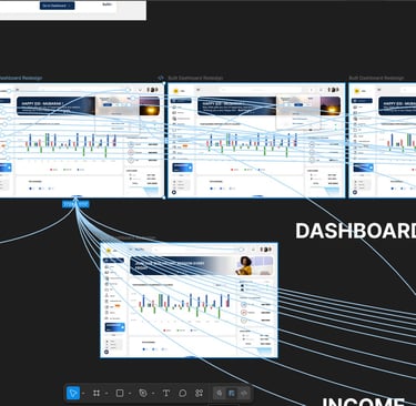
My task was to redesign the entire on-boarding experience and dashboard redesign to make easier, more intuitive AND visually engaging for users to on-board. The process focused on creating a modern user interface and a seamless user experience that simplified all complex workflows. This involved restructuring the information architecture and optimizing user flows.
Responsibilities
Wire framing
Visual Design
User Interface Design
User Experience Design
Micro interactions Design
High Fidelity Prototyping
Interaction Design
Tools


Project Duration
3 Weeks
Mock-Up Design
PROBLEM STATEMENT
PROBLEM STATEMENT
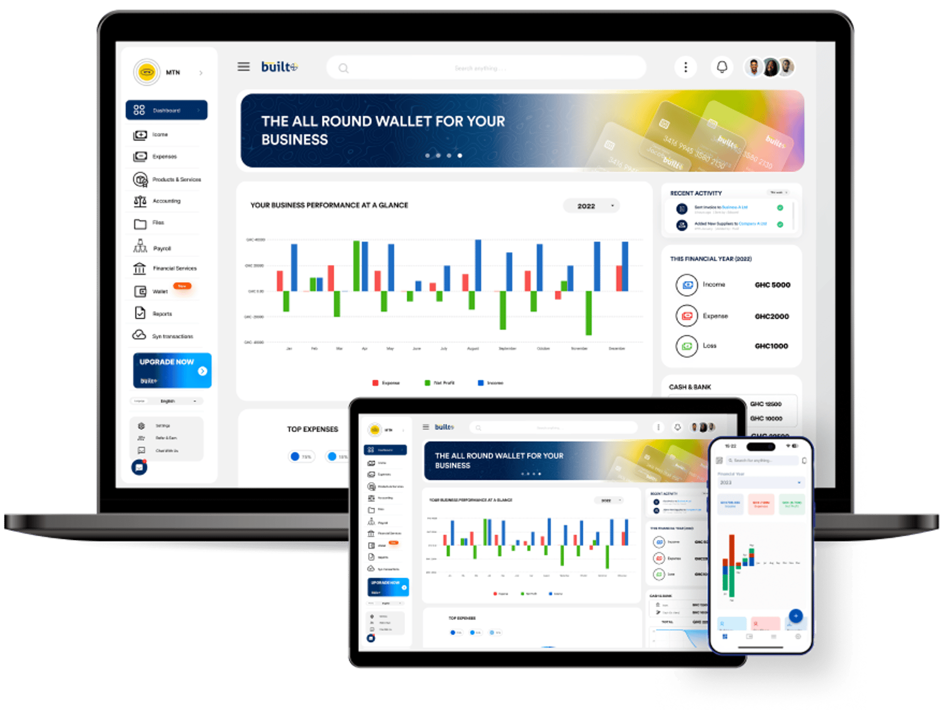
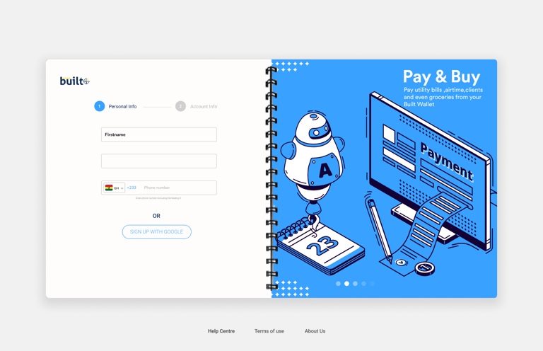
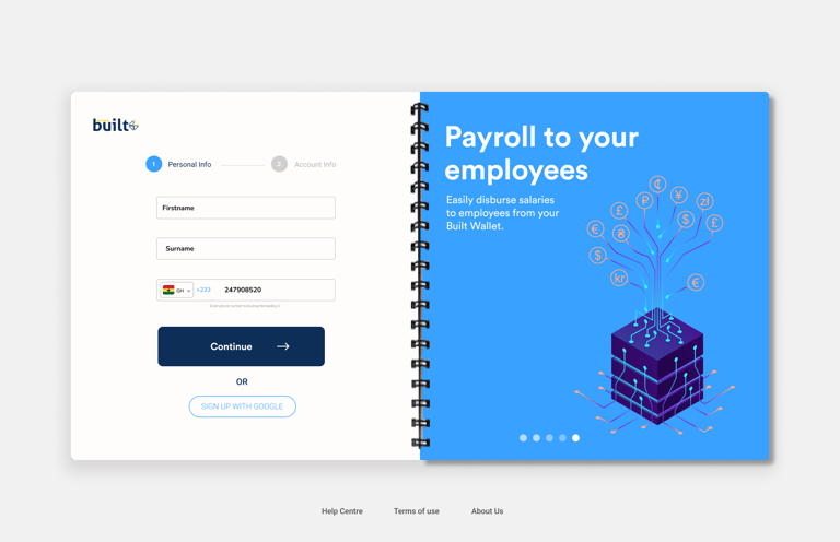
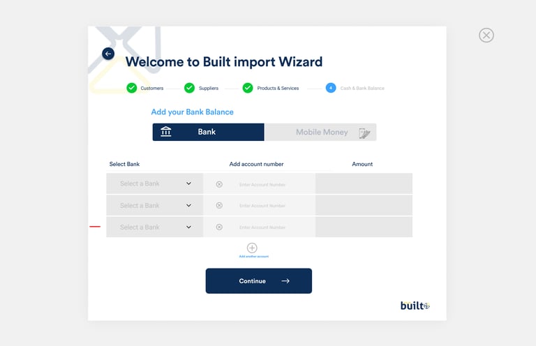
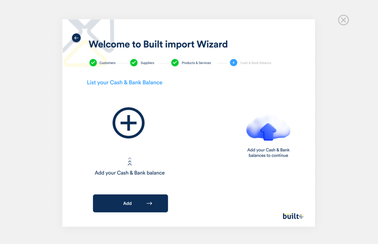
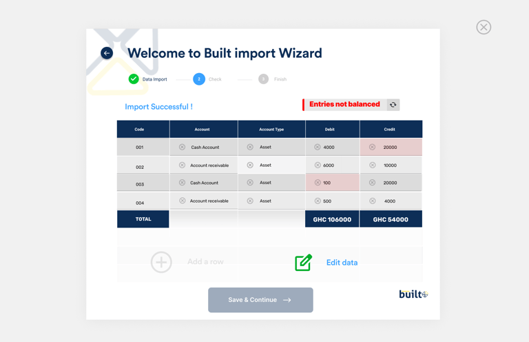
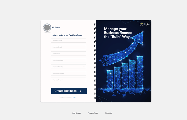
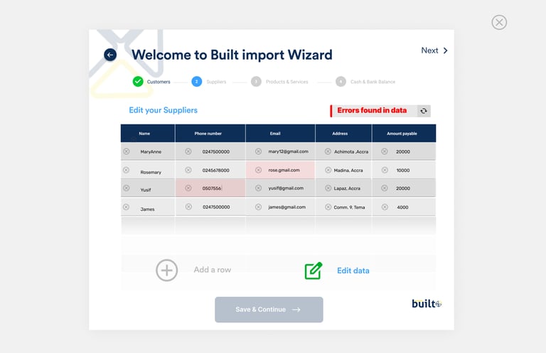
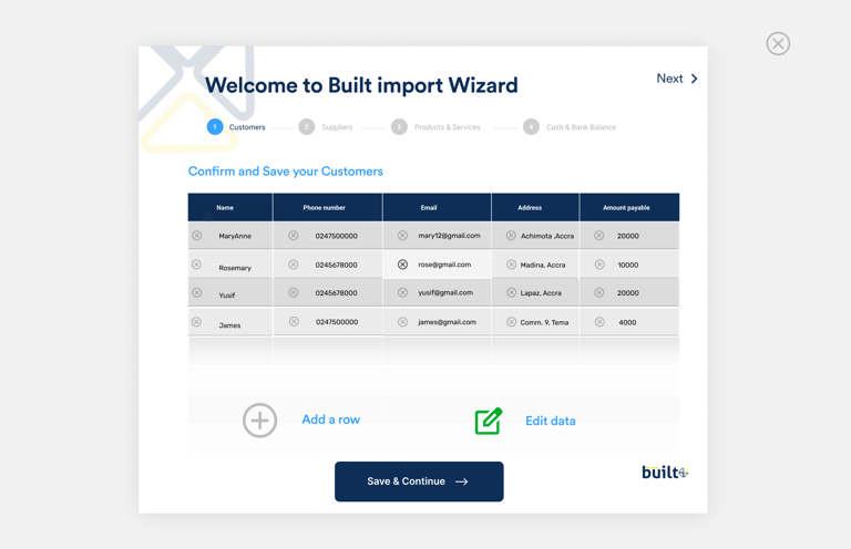
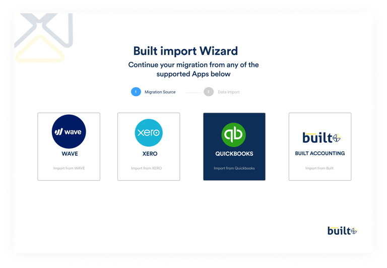
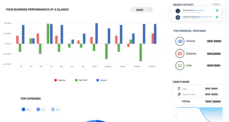
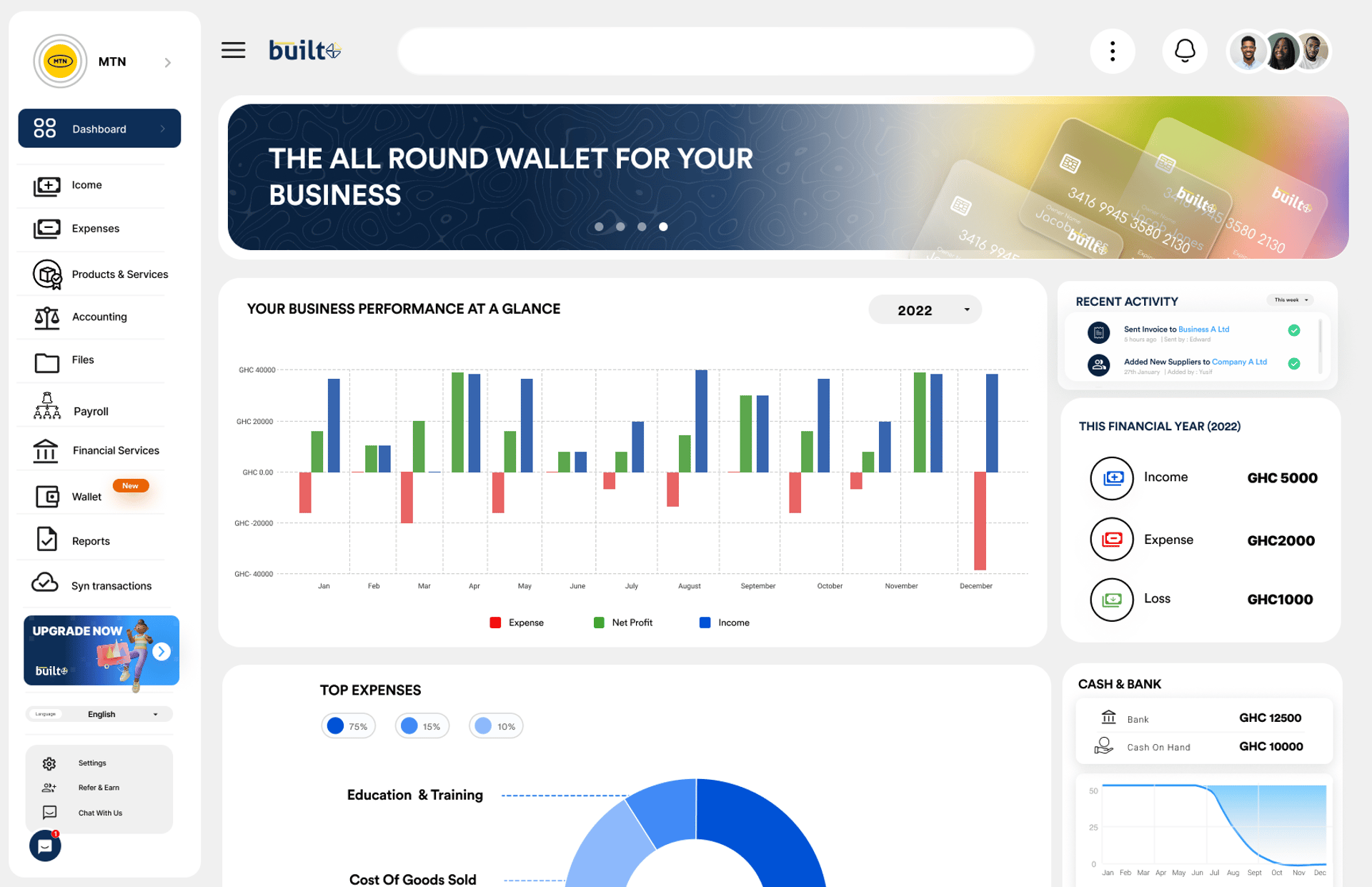
Users migrating from other accounting applications faced difficulties importing their existing files into Built Software, often encountering manual steps and unclear guidance during onboarding. This led to frustration, setup delays, and reduced adoption rates. The onboarding UX redesign focused on eliminating these manual processes by simplifying data migration, providing clear progress indicators, and ensuring a seamless transition experience. Additionally, the dashboard redesign aimed to make the interface minimalistic, visually appealing, and more user-friendly—allowing users to access key financial insights effortlessly while maintaining a clean, modern look that enhances overall usability and satisfaction.


Solutions
Automated Data Migration:
Designed a guided, step-by-step migration flow that automatically imports files from other accounting apps, reducing manual input and setup time.Progressive Onboarding Experience:
Introduced an onboarding wizard with clear progress indicators and contextual tooltips to help new users understand features quickly and confidently.Simplified Information Architecture:
Reorganized key accounting functions to make navigation more intuitive and reduce cognitive overload for users.Minimalistic Dashboard Layout:
Created a clean, distraction-free dashboard that highlights essential financial data and actions while removing unnecessary visual clutter.
Improved Visual Hierarchy:
Used color, typography, and spacing strategically to guide users’ attention to the most important insights and metrics.Personalized User Experience:
Enabled users to customize their dashboard widgets and view only the information most relevant to their role or business type.Consistent Design System:
Built a unified design system to ensure visual consistency across onboarding screens, dashboards, and other key interfaces.Interactive Feedback and Support:
Integrated in-app tips, help icons, and success confirmations to reduce uncertainty and enhance user confidence during onboarding.
Design Process
Test
Observe
Measure
Refine
Improve
I began with a User centered approach involving a mixture of the traditional method and the double diamond approach


Empathize
User Research
Survey
Define
Goals
Wants
Needs
Ideate
Brainstorm
Create
Visualize
Refine
Prototype
Design
Test
Iterate
Validate
EMPATHY MAP
I used an empathy map to understand the customer's needs, helping me design a solution that improves the already existing system.
THINKS
SAYS
DOES
FEELS
I hope this platform saves me time, not adds more work.
I’m worried about losing important data during migration.
A modern, intuitive dashboard would make managing finances smoother.
Struggle to manually upload data from previous accounting tools.
Spend extra time searching for key financial data on the dashboard.
Rely on customer support or tutorials for guidance.
It’s hard to move all my data from my old software.
The dashboard feels cluttered; I just want to see what’s important.
I’m not sure where to start after signing up
Frustrated by complex migration and onboarding processes.
Overwhelmed by too much information on the dashboard.
Relieved and confident once the onboarding becomes simpler and the UI feels intuitive and visually appealing.
PAIN POINTS
Complex Data Migration: Manual and confusing import process made switching from other accounting apps difficult.
Cluttered Dashboard: Too much information caused confusion and slowed task completion.
Unclear Onboarding: Lack of guidance made it hard for new users to get started quickly.
USER PERSONAS
Daniel Owusu — Accountant
Age: 41
Location: Kumasi, Ghana
Occupation: Independent Accountant managing multiple clients
Goals:
Handle multiple clients’ accounts efficiently.
Reconcile transactions quickly and maintain accurate records.
Frustrations:Manual setup for new clients wastes time.
Difficulty navigating a cluttered dashboard with too many options.
Lacks customization for frequently used tools.
Needs:Automated data import for new clients.
A customizable dashboard for quick access to key accounting features.
Ama Boateng — Finance Officer
Age: 29
Location: Takoradi, Ghana
Occupation: Finance Officer at a growing startup
Goals:
Ensure transparent and organized financial reporting.
Monitor team expenses and audit trails easily.
Frustrations:Onboarding new team members is slow and confusing.
Hard to find important data at a glance on the dashboard.
Needs:Simplified onboarding with clear feature explanations.
A minimal, visually appealing dashboard for quick insights.
Sarah Mensah — Small Business Owner
Age: 34
Location: Accra, Ghana
Occupation: Owner of a boutique retail business
Goals:
Manage business finances efficiently without hiring a full-time accountant.
Track invoices, expenses, and cash flow in one place.
Frustrations:Finds it hard to migrate data from her previous software.
Feels overwhelmed by too many dashboard features.
Struggles to understand reports without clear visuals.
Needs:Simple onboarding with guided steps.
A clean, intuitive dashboard showing only key business metrics.
Kofi Asante — Startup Founder
Age: 37
Location: Tema, Ghana
Occupation: Founder of a tech startup
Goals:
Gain real-time visibility into the company’s financial health.
Streamline accounting processes to focus more on business growth.
Frustrations:Current onboarding process takes too long and feels overly technical.
The dashboard shows too much data, making it hard to track key metrics.
Needs:Fast, automated onboarding with minimal setup effort.
A clean, data-driven dashboard highlighting core business insights.
STYLE GUIDE
TYPEFACE : CIRCULAR STD
Empowering Churches to Grow, Connect, and Thrive.
COLOURS :
Deep blue ,
Turquoise
Light green
092e58
ffa800
#f0f0f0
IN-APP SCREENS


PROTOTYPING
CUSTOM COMPONENTS


Click the button below to view prototype

THANK YOU
Lets connect
My Case Studies
Follow me on :
+233501594329
© 2025. All rights reserved.
CONTACT me on :
contact@jamesbeduaddo.com
Fillyjobs App
FillyChurch management software
MTN Hottseat App
Built GIZ App
Accounting Hero App